Tatranská
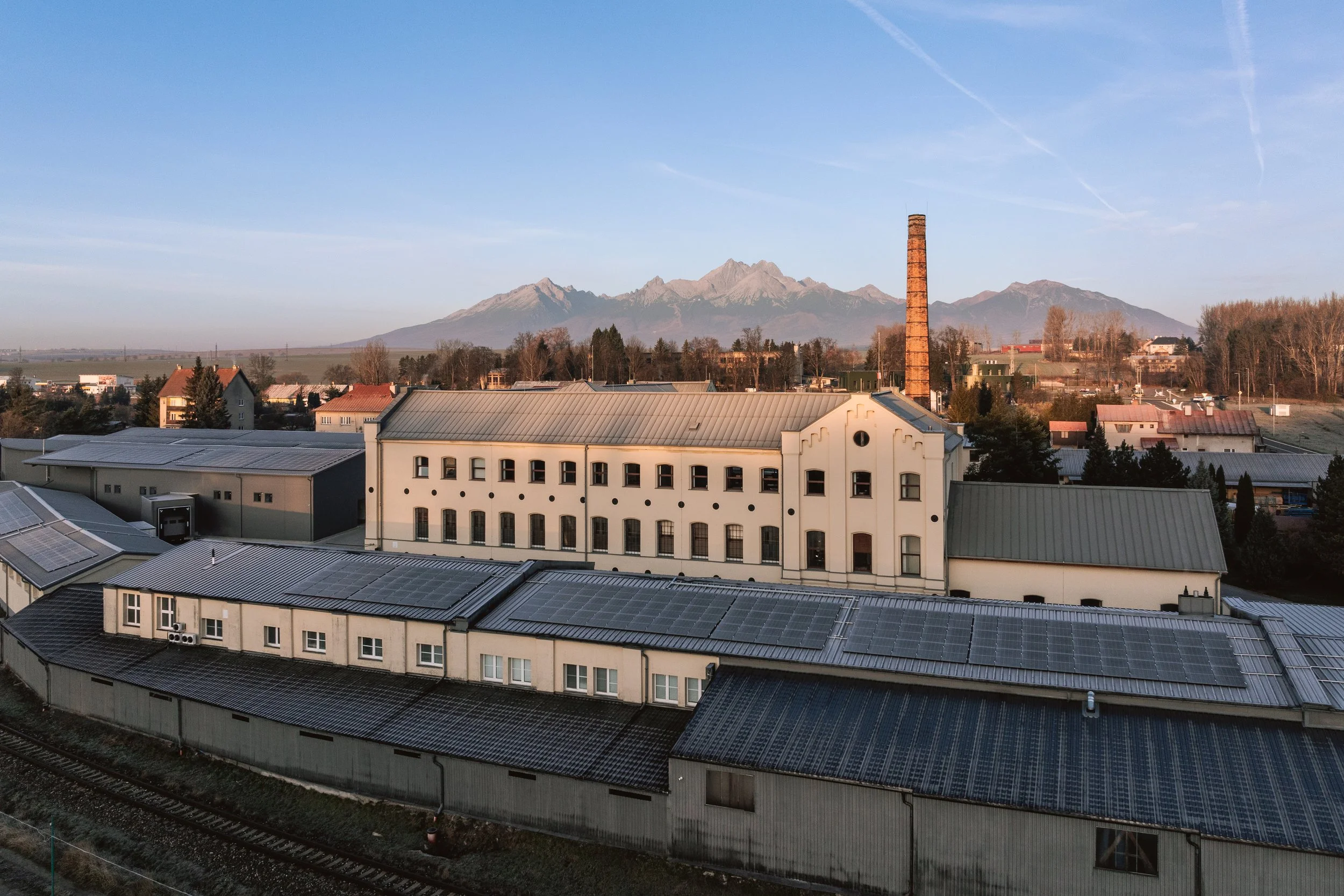
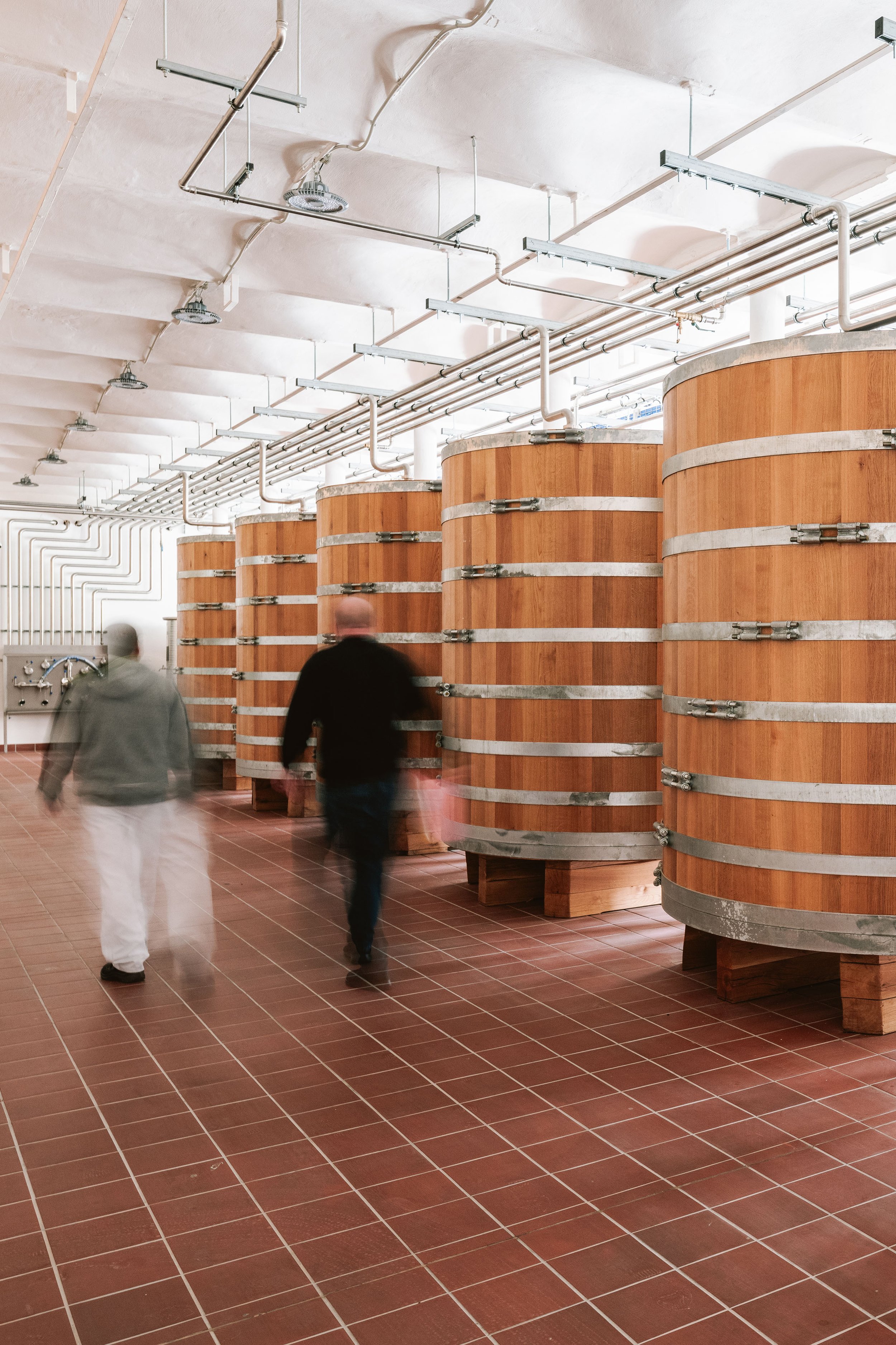
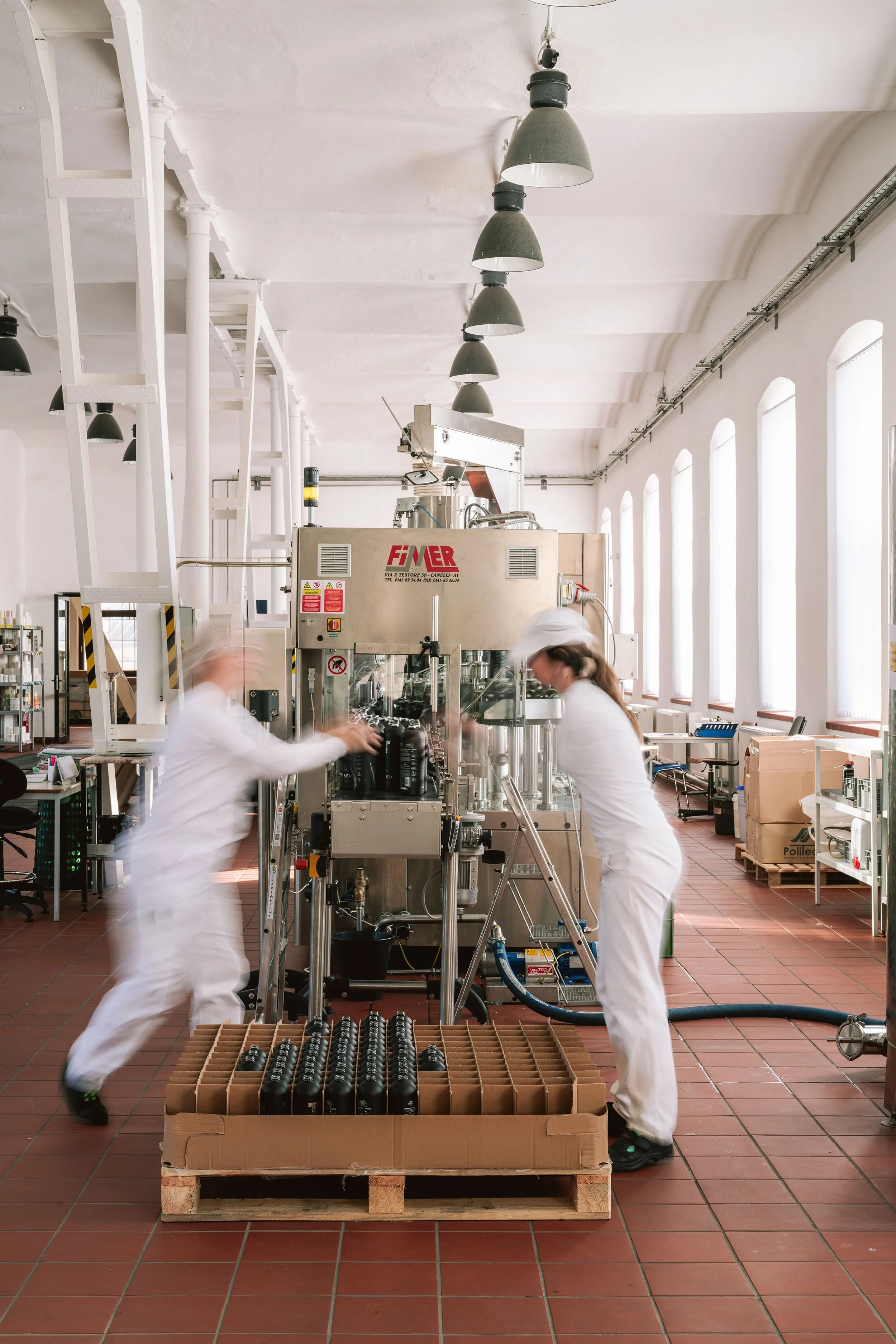
Located at the foot of the Tatra Mountains in a beautifully converted former spinning mill, Tatra Distillery is passionate about returning to its roots—producing high-quality distillates from locally sourced fruit using traditional fermentation methods.

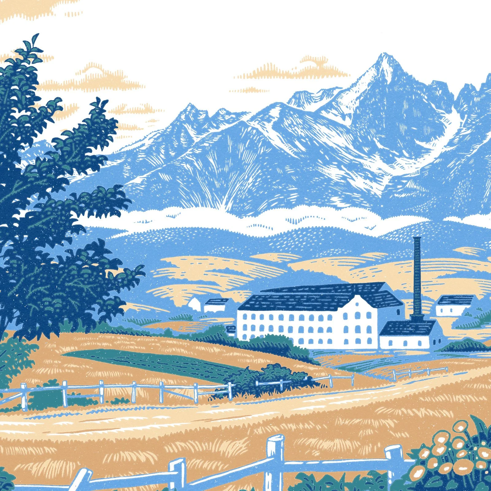
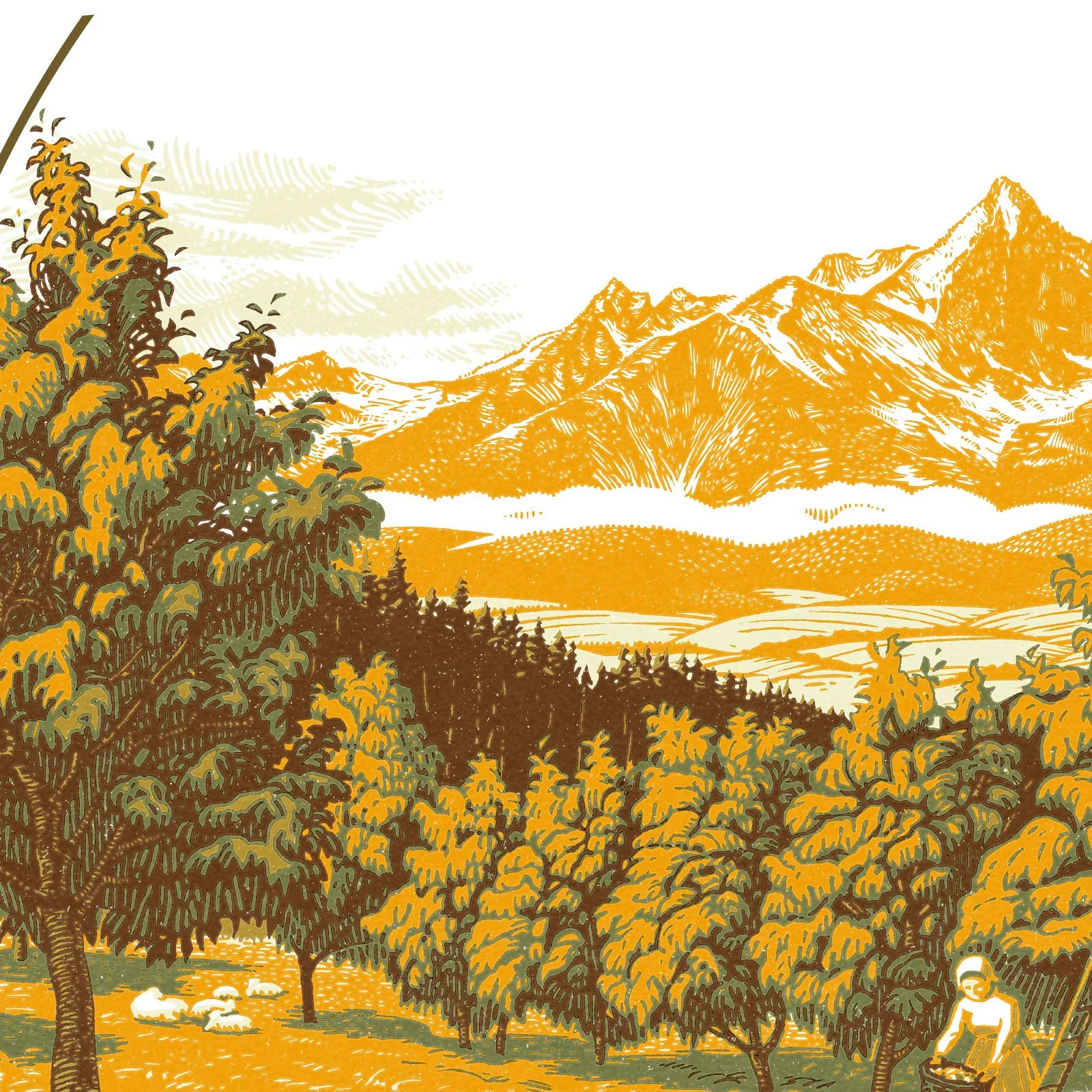
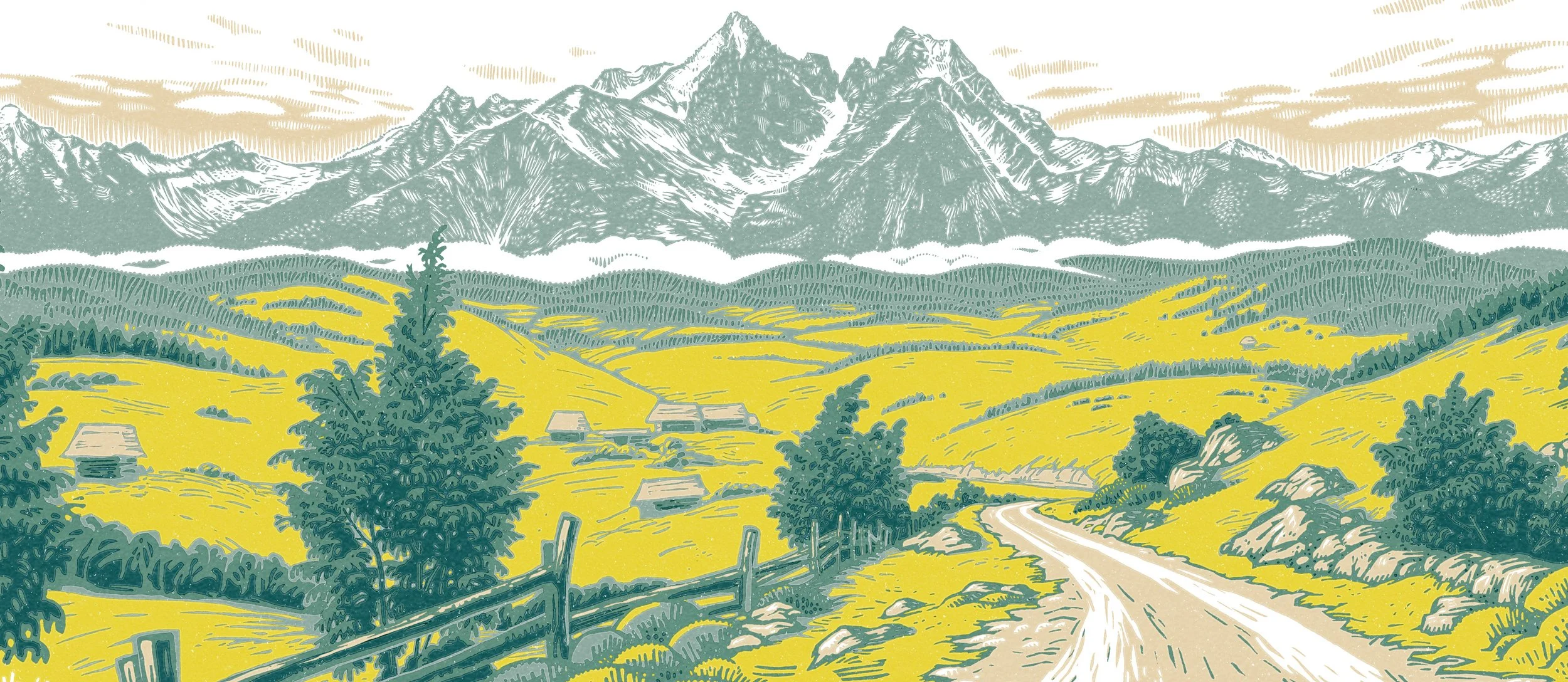
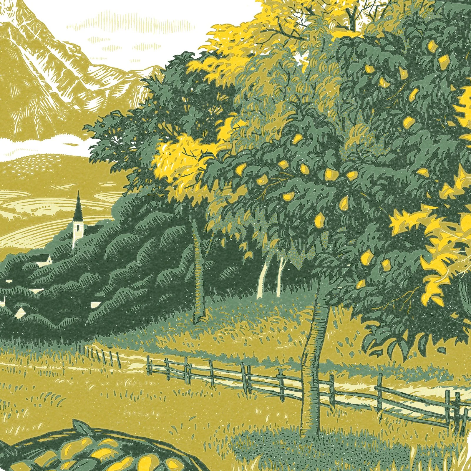
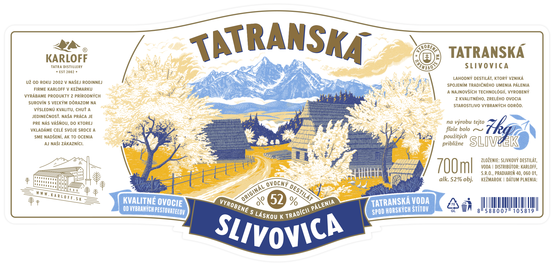
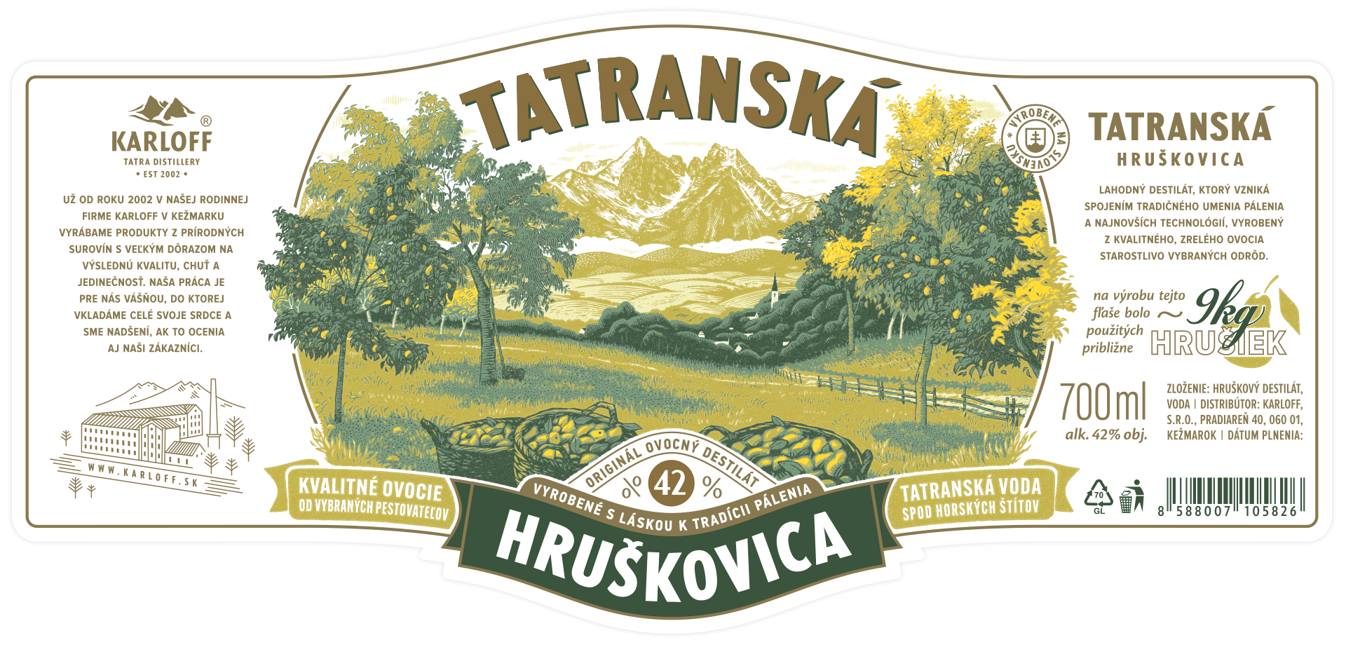
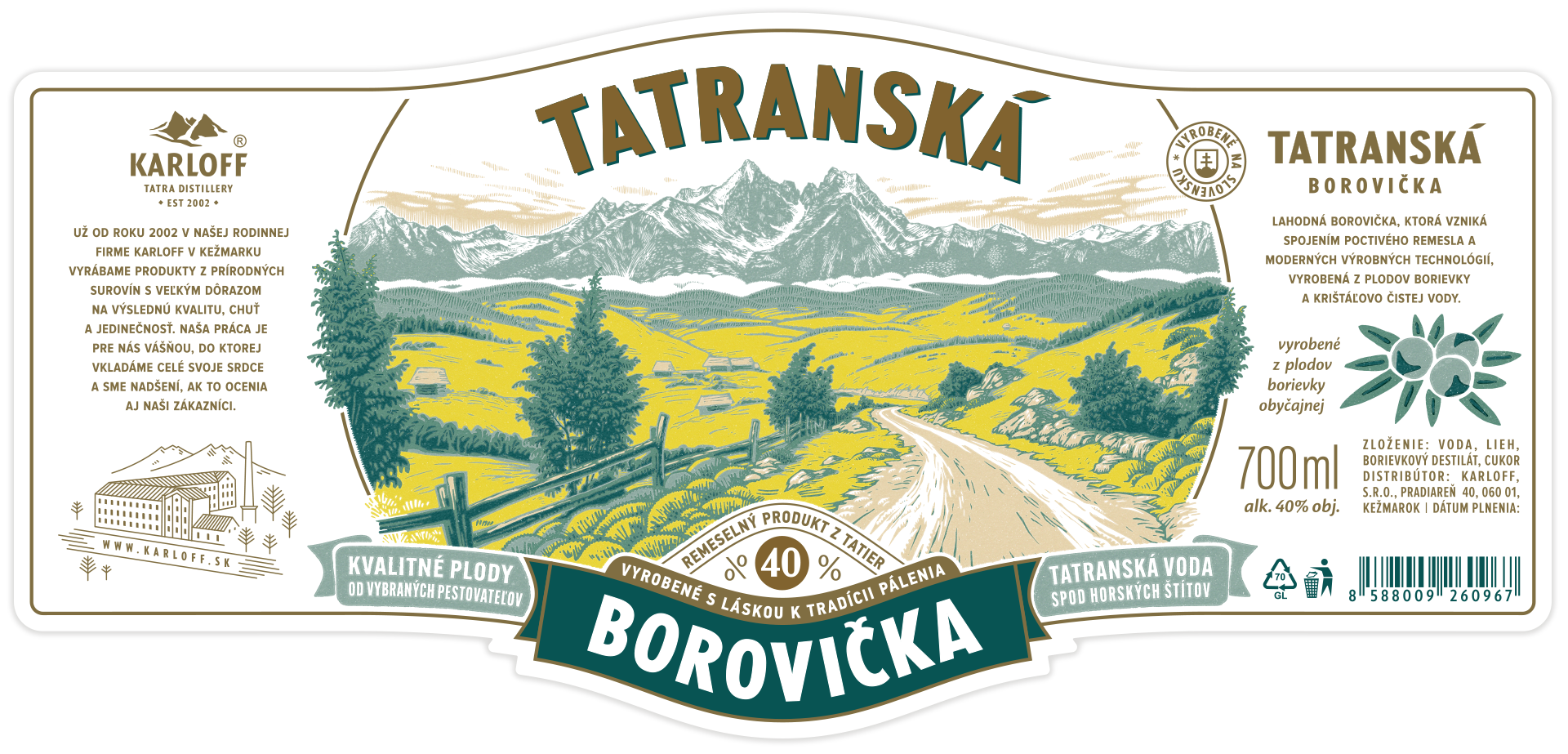
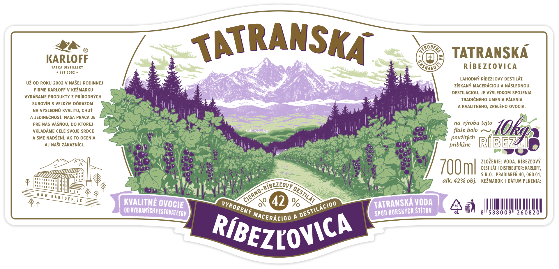
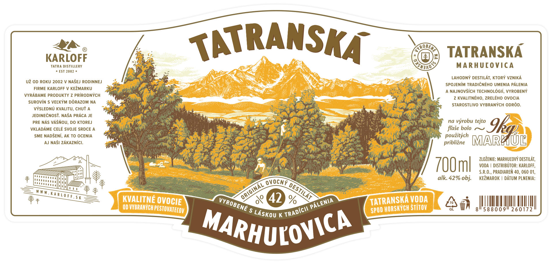
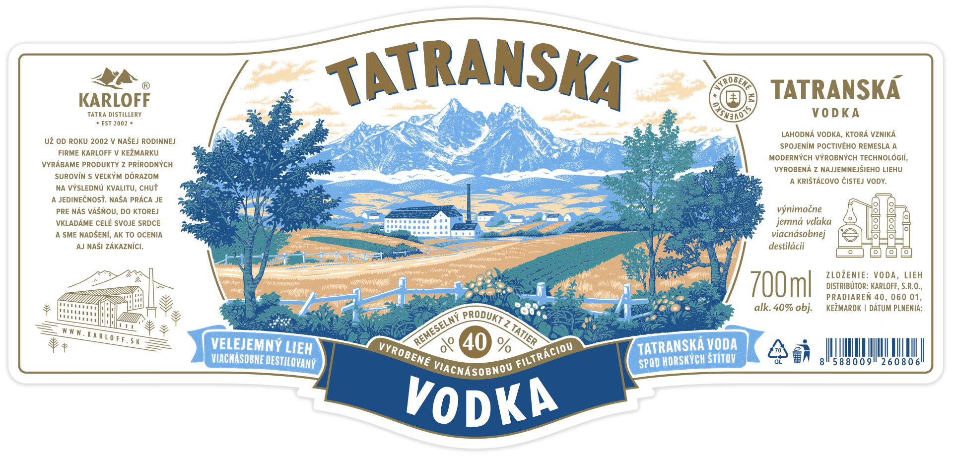
The client asked us for a highly illustrative label, without falling back to the obvious fruit illustrations. One that would carry a vintage touch while still reading as contemporary.
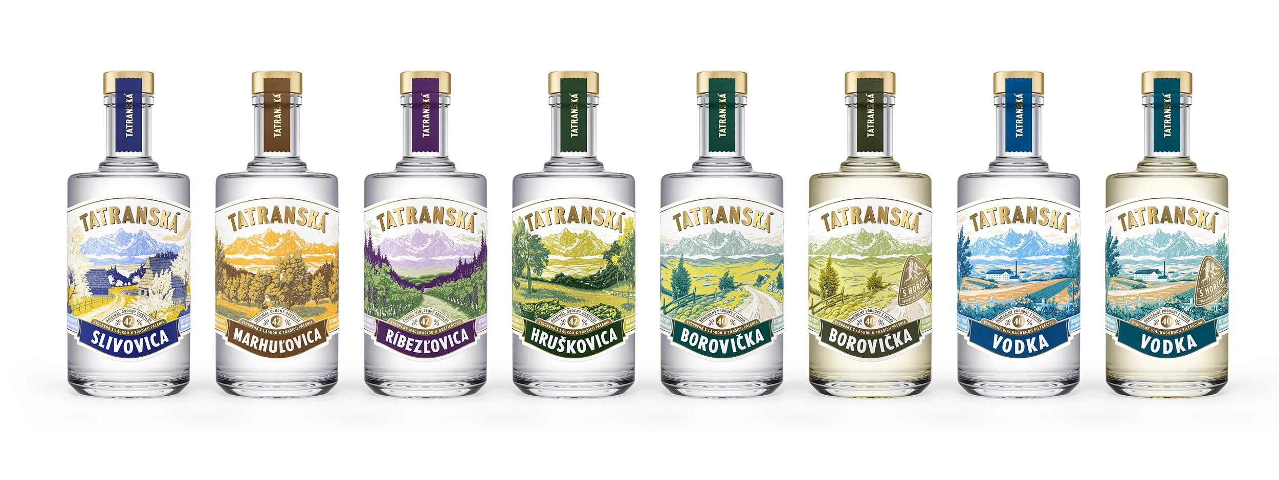
The name pointed the way to a motif. Tatranská takes its name from the Tatra mountains, the very backdrop of the distillery itself, so the mountain range became the main part of the illustration, a repeating element across the whole range, with only the foreground changing from product to product. Every illustration follows the same overall form, which let us use a single hot-stamping die across multiple products.
To get that crafted, vintage feel, we drew on Gustave Baumann's intricate woodcuts as a reference point. The woodcut style itself was built digitally, which meant the foreground could be swapped out easily while still keeping a perfect fit with the mountain backdrop behind it.
Each illustration is built from five separate color layers, printed in specific spot inks onto Fasson® Artisan uncoated paper, which made the woodcut art look like lifted straight off a wall and onto the bottle.
One detail we're particularly fond of: the side of the label lists the amount of fruit that goes into making a single bottle. Not many people realize it takes 10kg of blackcurrant to make just one bottle of brandy.
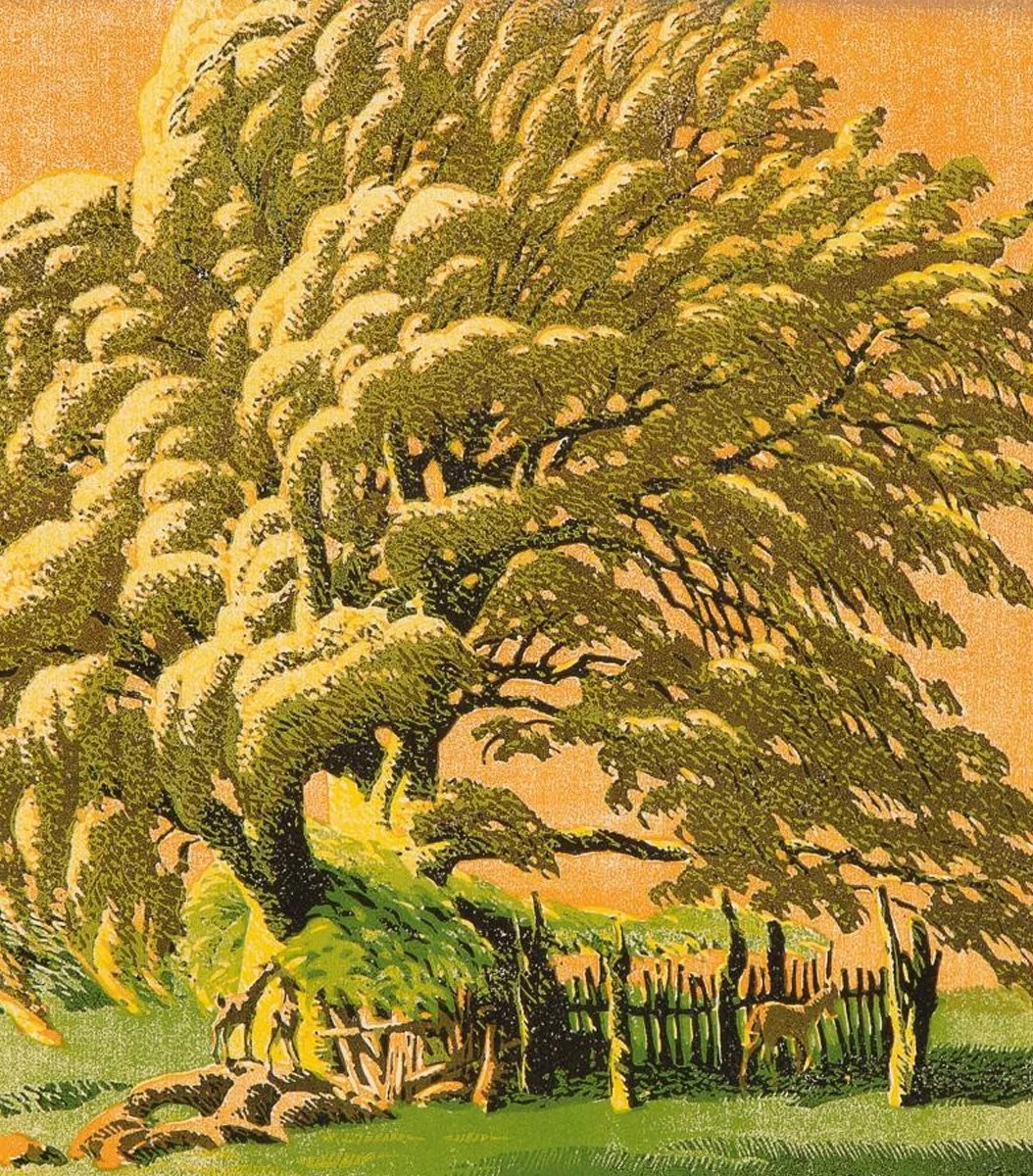
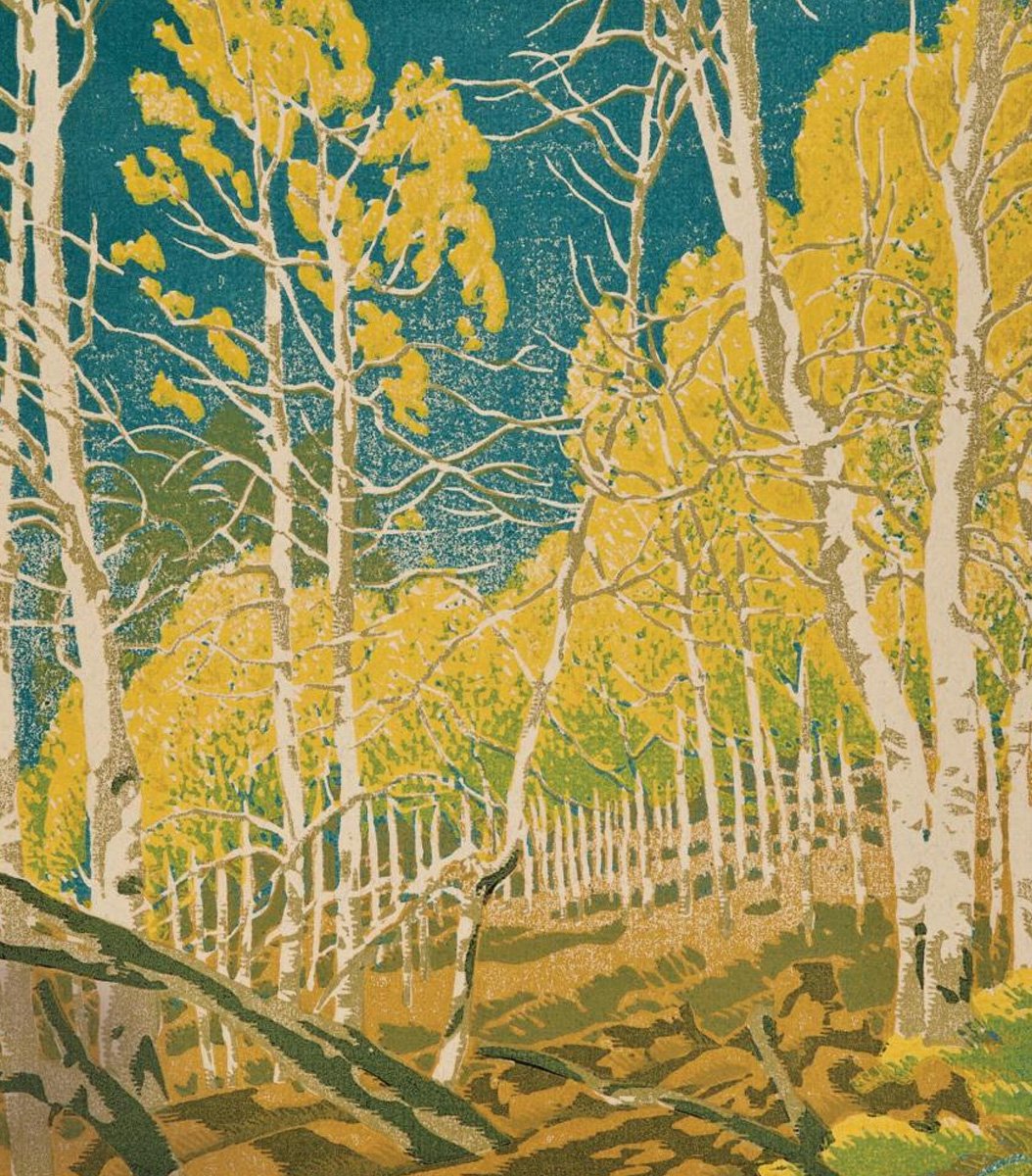
Woodcut prints by Gustave Baumann (1961, 1957)