Kavalero
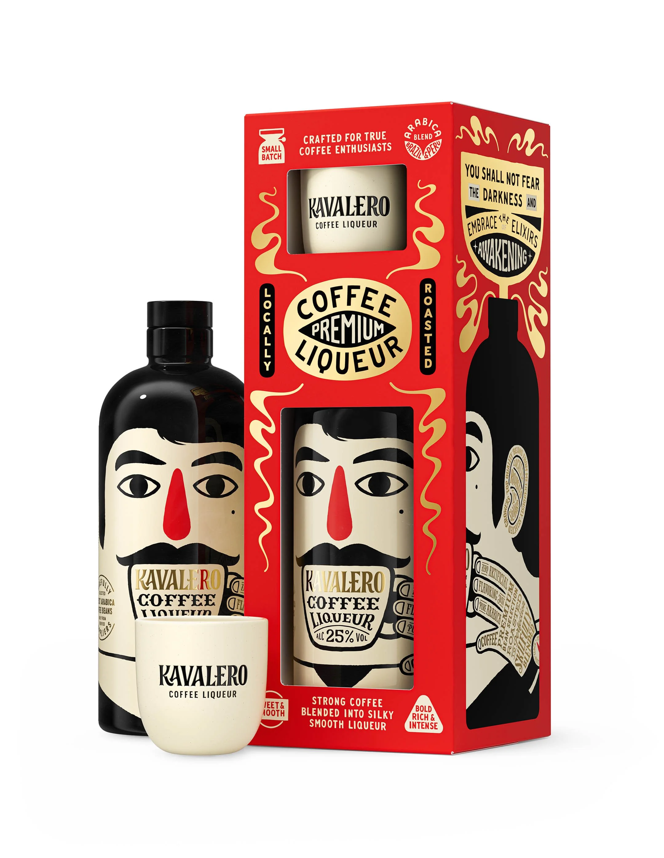
From the name to the design, we set out to create something truly unique and unforgettable. We wanted the amount of hands-on work that goes into making this product to come through in the packaging itself. That's why the packaging is also entirely hand-drawn, including all of the typography.
The idea for Kavalero came from ruminating on the personality of the brand's customer. That train of thought led to caballero, the Spanish word for “gentleman,” which blended perfectly with kava, the word for coffee in many European and non-European languages alike.
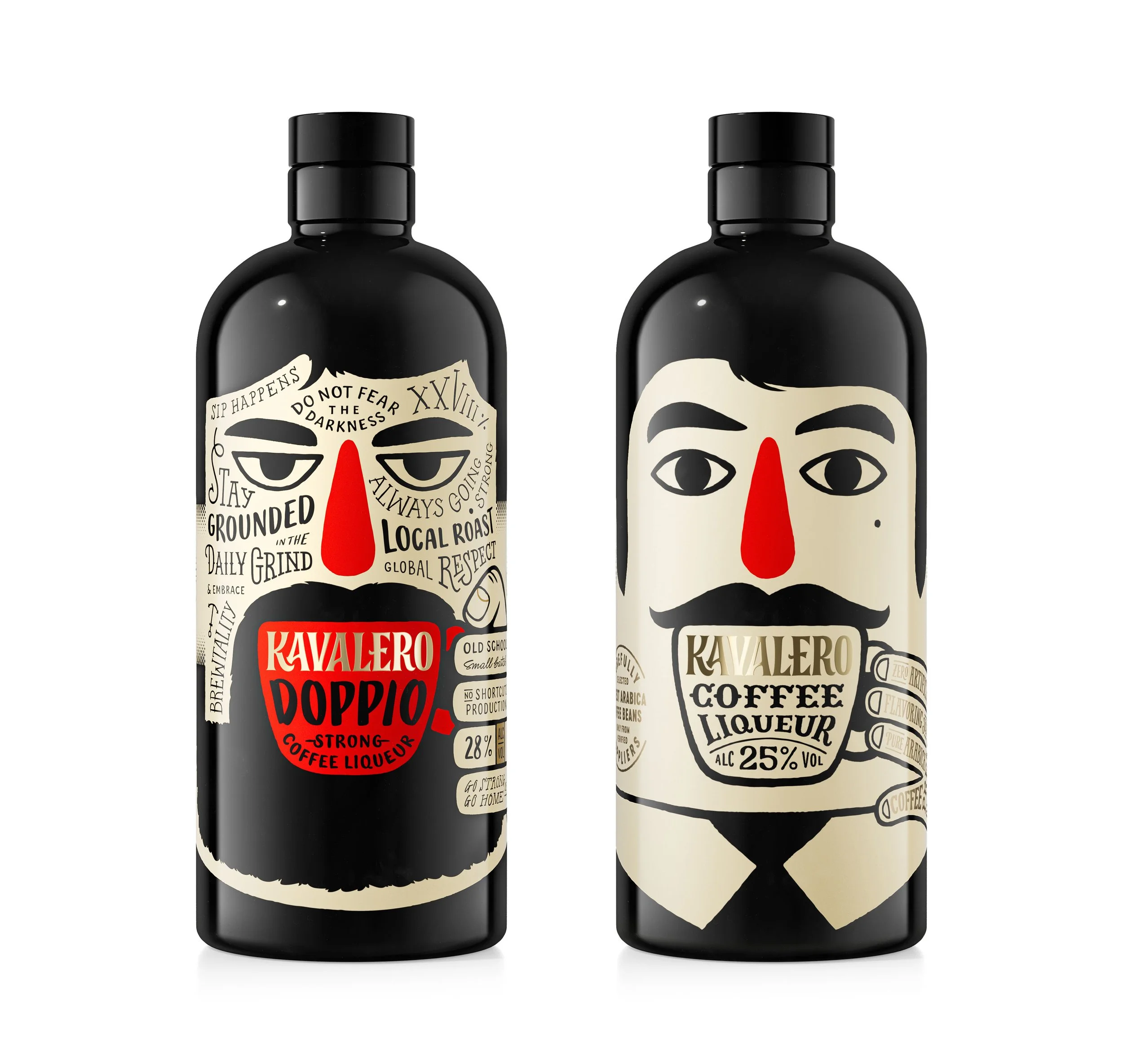
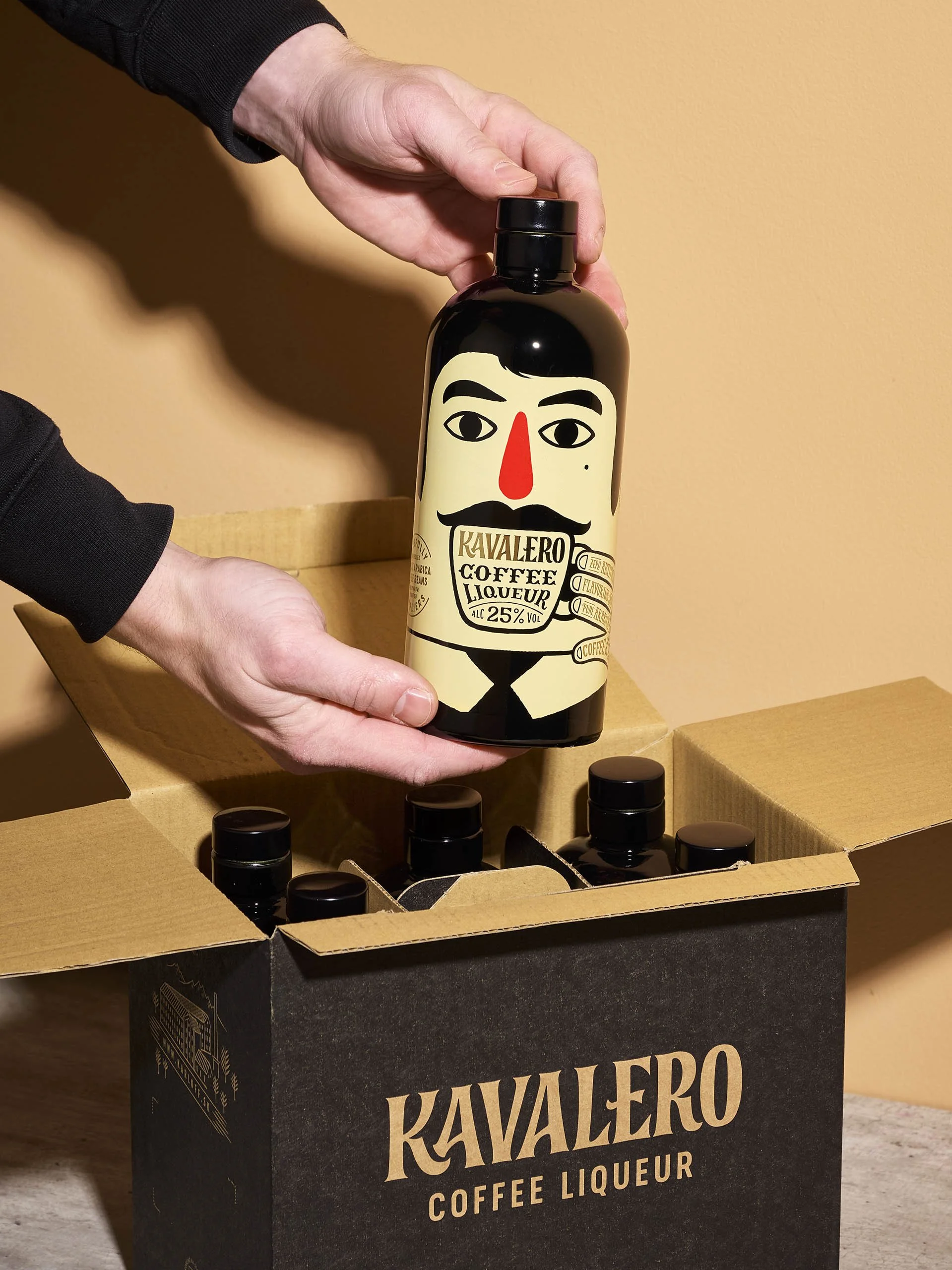
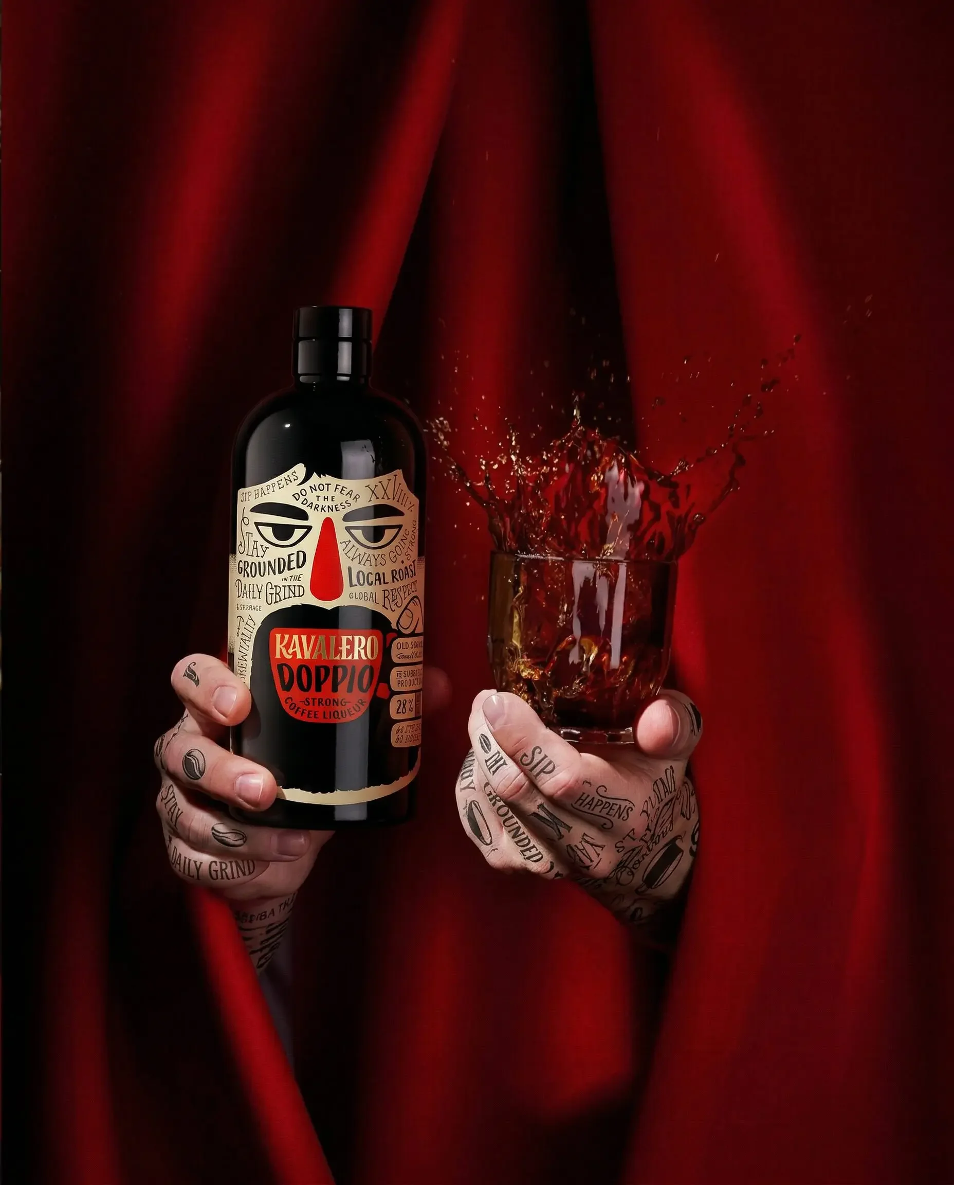
We initially thought this funky gentleman would work as more of a symbol, a kind of logo. But while sketching on a paper-covered bottle, we drew a pair of eyes and a moustache just for fun, and the solution jumped out at us. So we kept going, completing the sketch all the way around the bottle. That left one question: where would all the text go? Tattoos, of course. To preserve the quirky character, the entire design was kept exactly as it appeared in that first sketch — something we'd certainly never done before.
As a complement to the original, Kavalero Doppio is the rougher, more caffeinated sibling of Kavalero. To reflect the product's stronger character, we gave the original gentleman “breaking bad” makeover. The same character, only rougher, stronger. More prominent tattoos and a fuller beard helped push him in that direction.
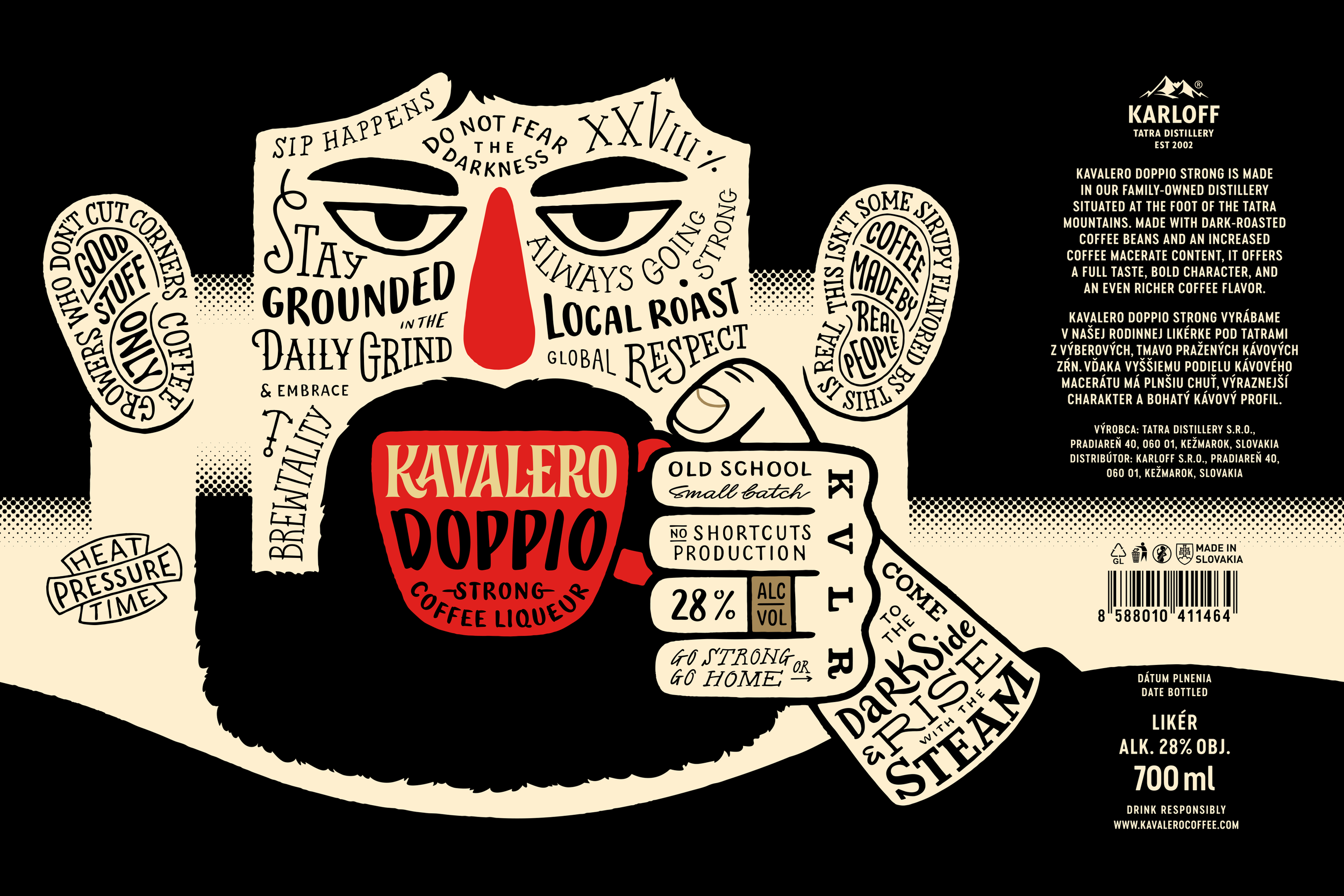
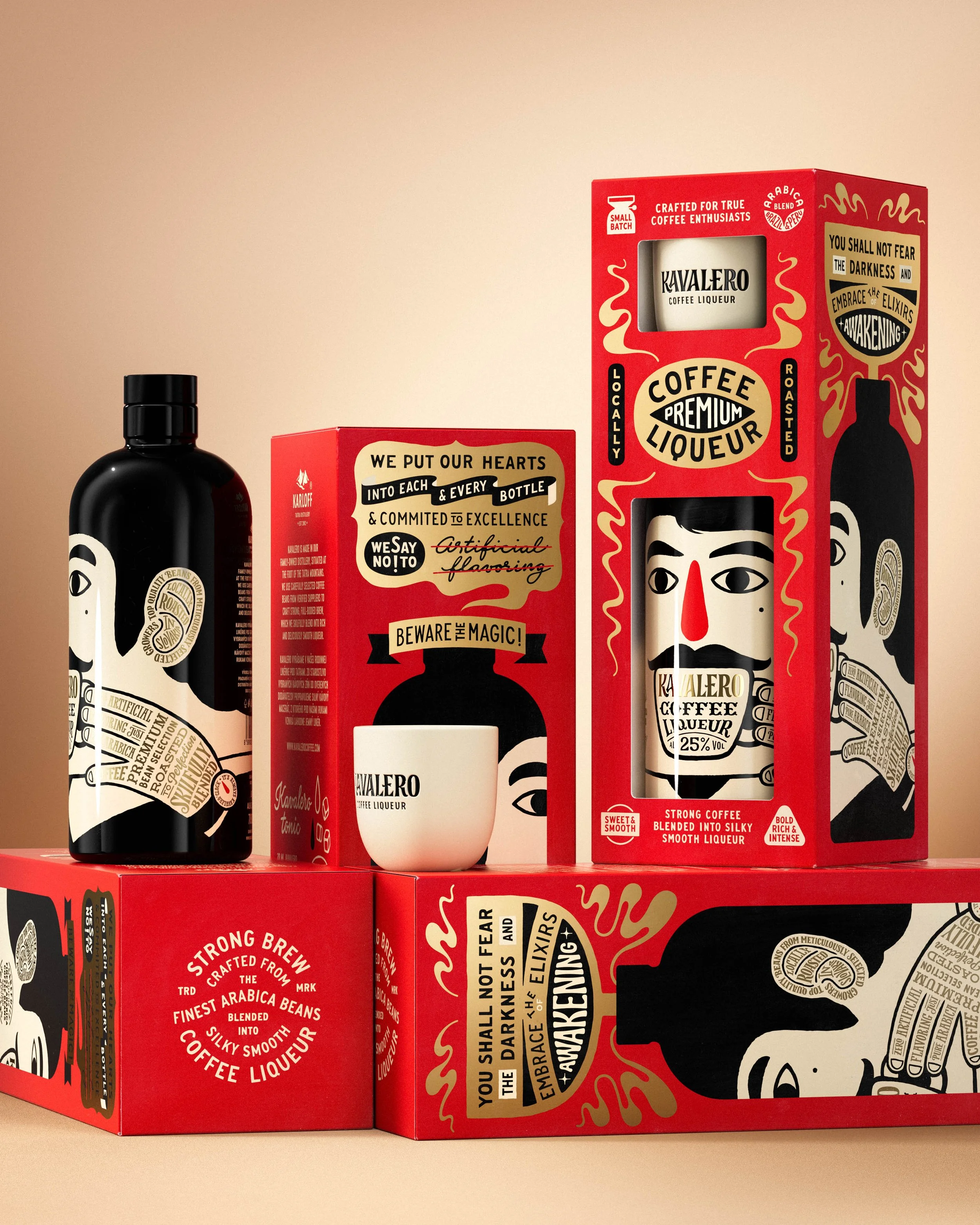
We opted for a stock bottle shared across multiple products for logistical and economic reasons. Each bottle is spray-painted with a glossy black finish, then screen-printed in three additional colors, overprinted on each other, and finished with hot-stamped foil. Dropping the label gives the bottle the feel of a single, cohesive object. It also eliminates the need for glue, resulting in a smaller environmental footprint.
For the project, we also designed a range of supporting materials and packaging boxes.