Herberry
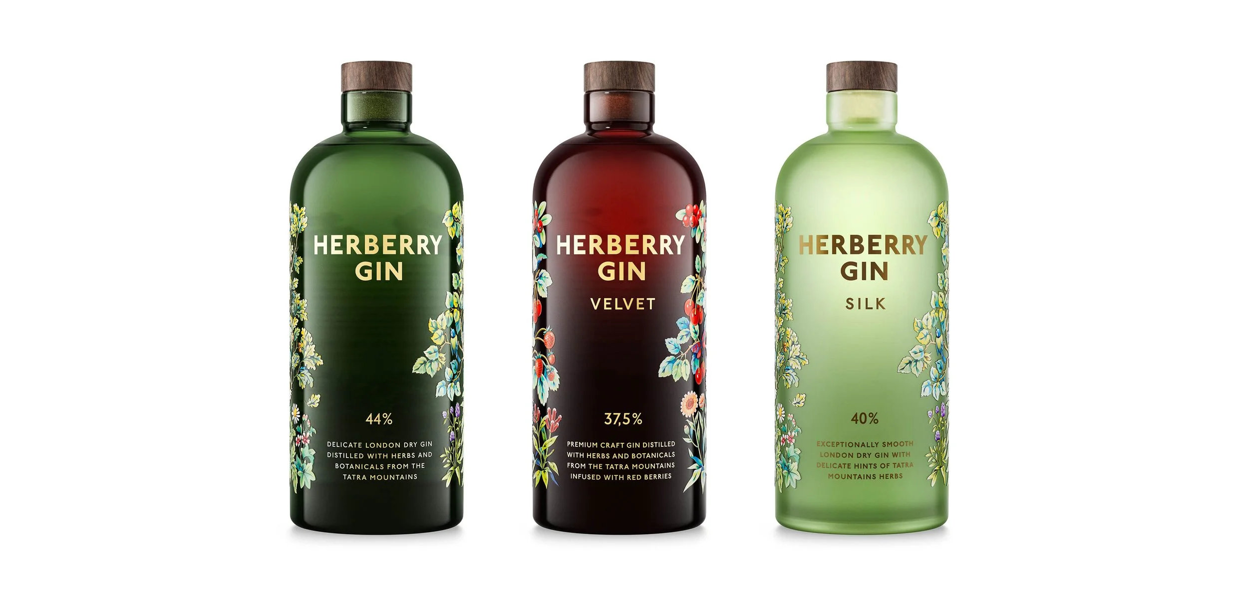
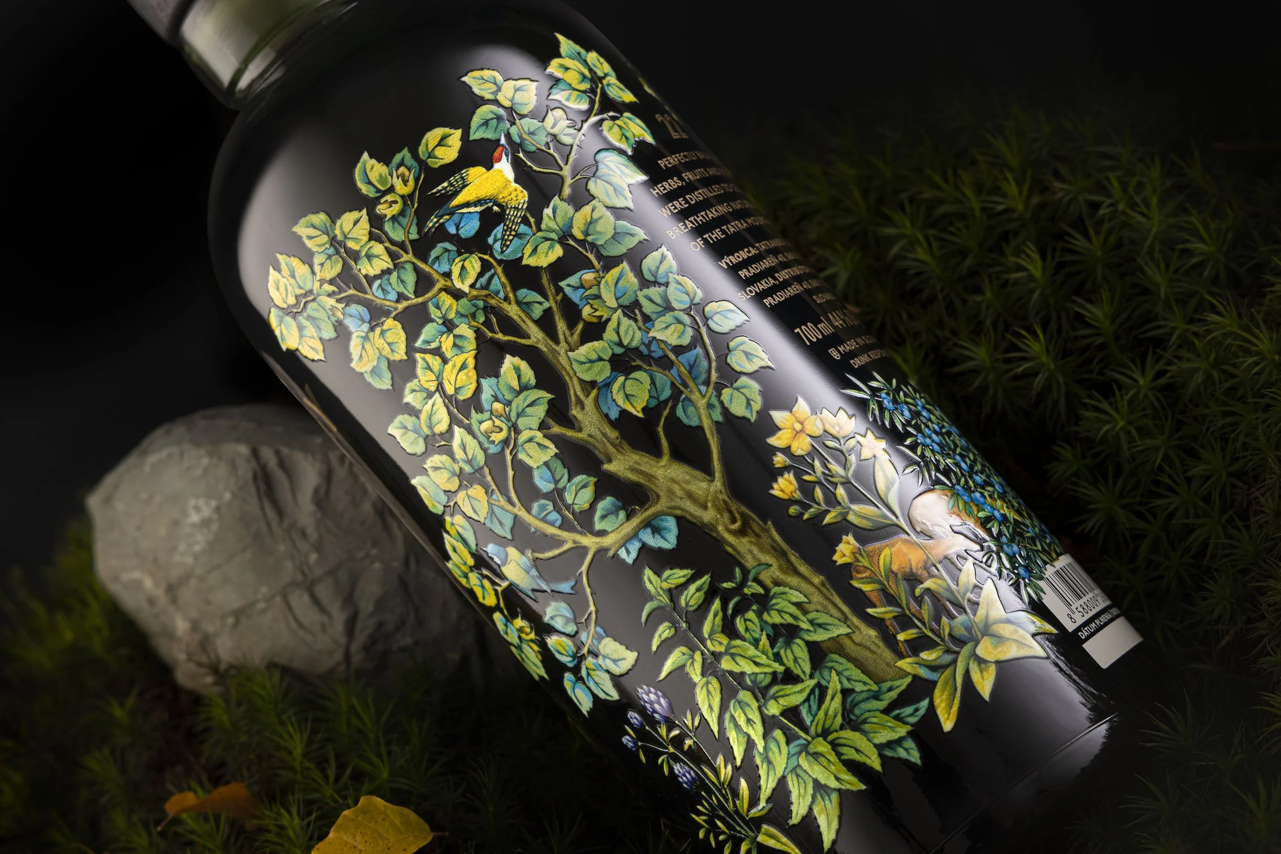
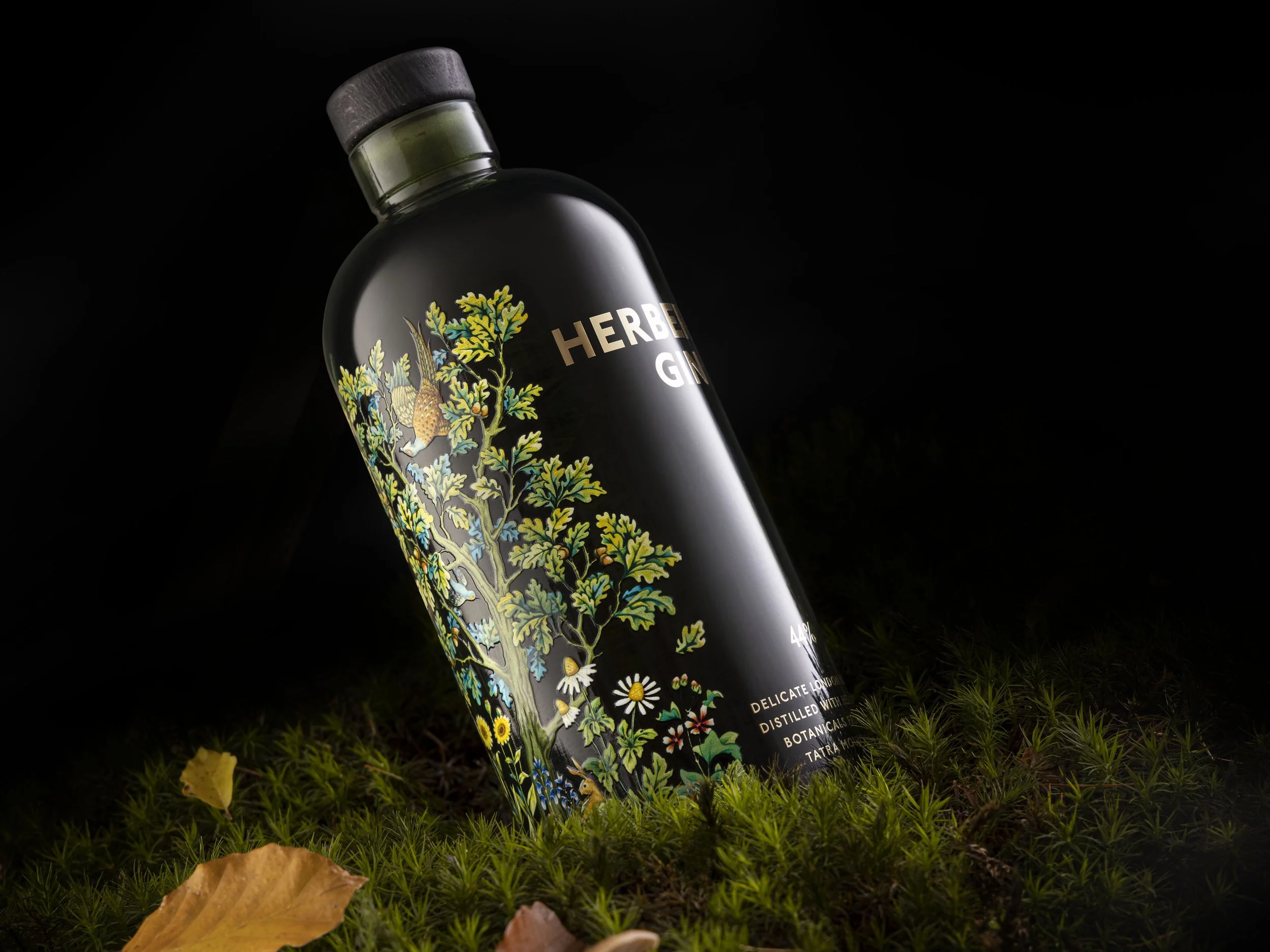
Designed for the Tatra Distillery, Herberry is an exceptionally smooth, small-batch gin, crafted with a unique blend of 22 herbs and fruits. With its intricate illustration of local flora and fauna and its distinctive pharmacy-style bottle, Herberry channels the spirit of old-world apothecaries and celebrates the botanical richness of the Tatra mountains region.
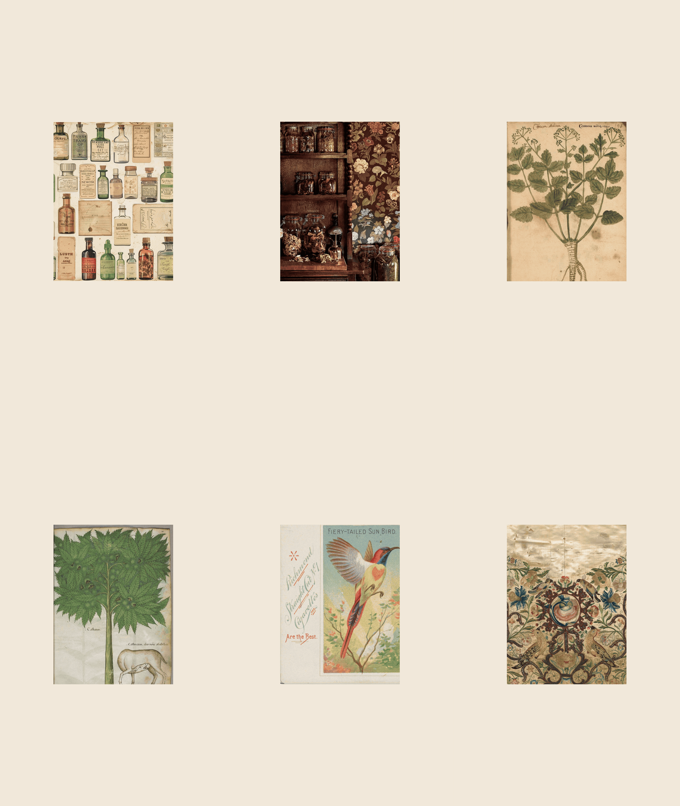
Herberry is a craft gin from the Tatra mountains, designed around it’s deep herbal character. The brief was to create a brand and packaging honest to that origin, rooted in a place and the tradition behind the product, but with a presence that felt contemporary.
The apothecary bottle was a natural fit. Traditional gin-making shares its roots with the old craft of botanical medicine, and the shape carries that connection. It is also a classic, neutral form — chosen not only because of it’s flat vertical surface, but also because we were developing another small batch product at the same time for which the same bottle worked equally well. Using a shared vessel across both products simplified logistics, standardized carton sizing, and kept production and shipping costs manageable for a small batch operation.
Rather than working with tinted glass, which would have locked us into standard color options, we chose color coating. This gave us precise control over tone, transparency and vibrancy, and left room for variation across the product line as it grows.
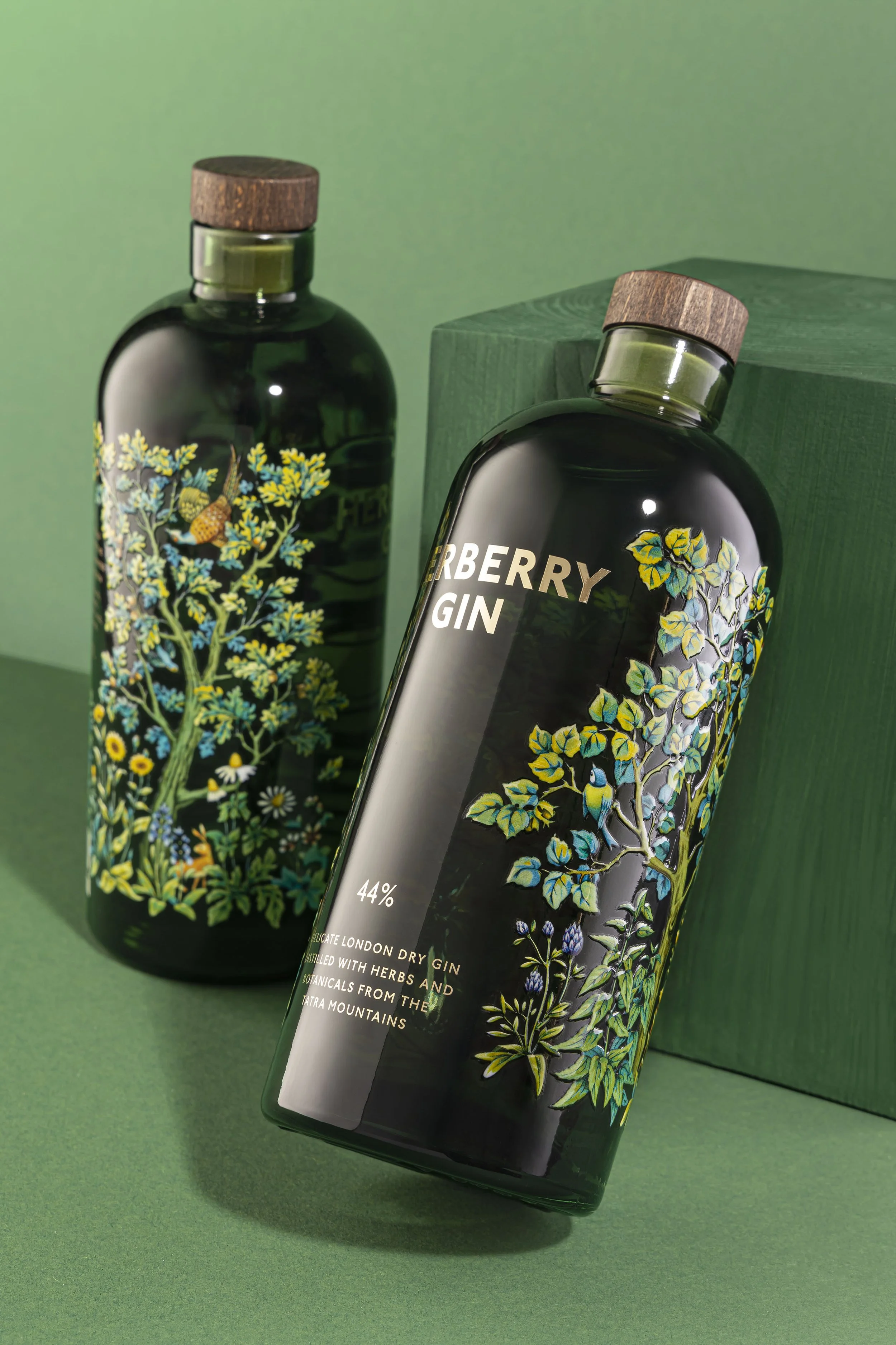
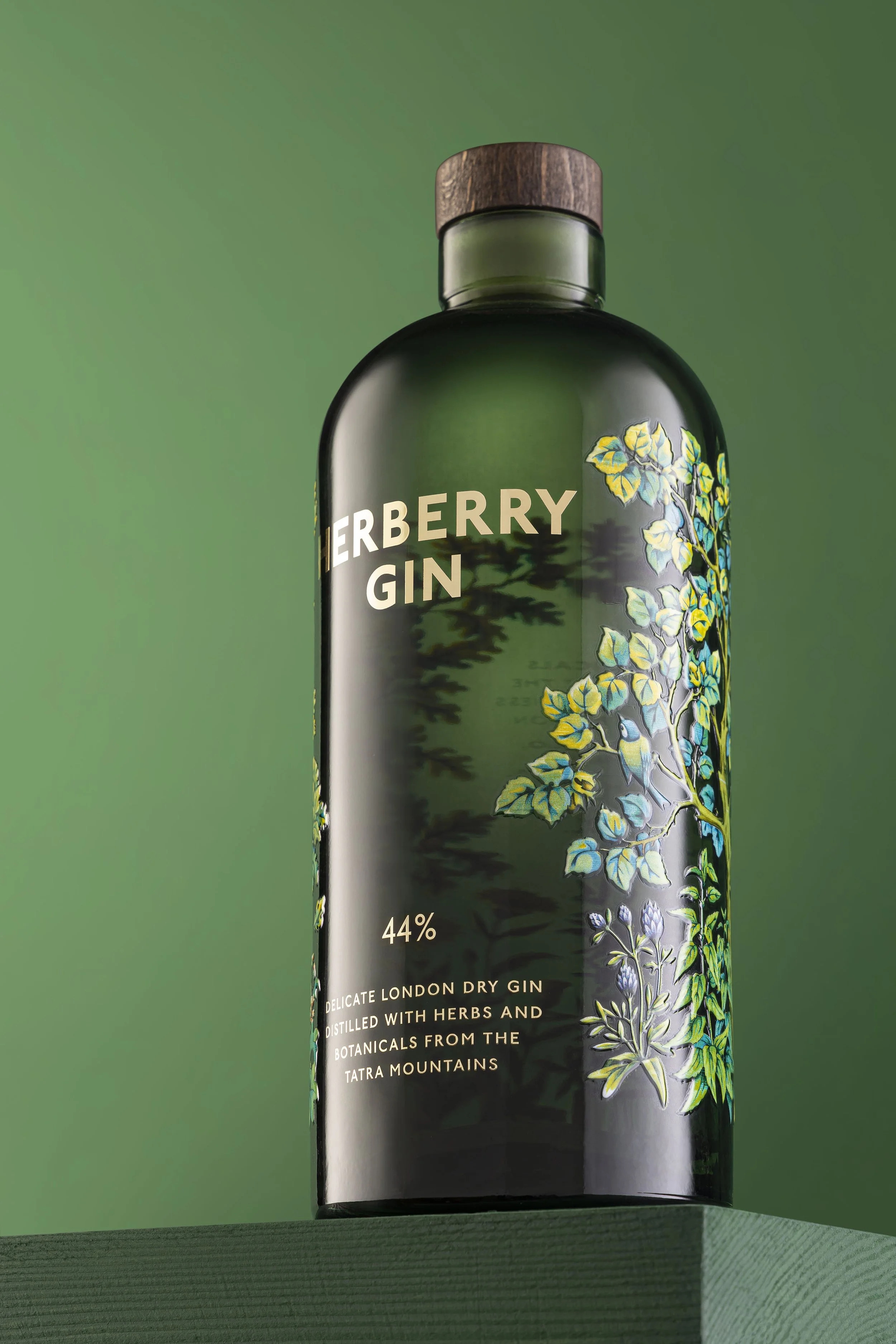
On a bottle with such a large, continuous glass surface, a paper label would have felt too loud. We wanted the object to stay quiet and refined, so opted for on-bottle decoration. Without glue and paper the bottle has a natural second life. We noticed people tend to keep it, most often repurposing it as a vase. The absence of adhesive and paper is also an ecological consideration albeit a small one.
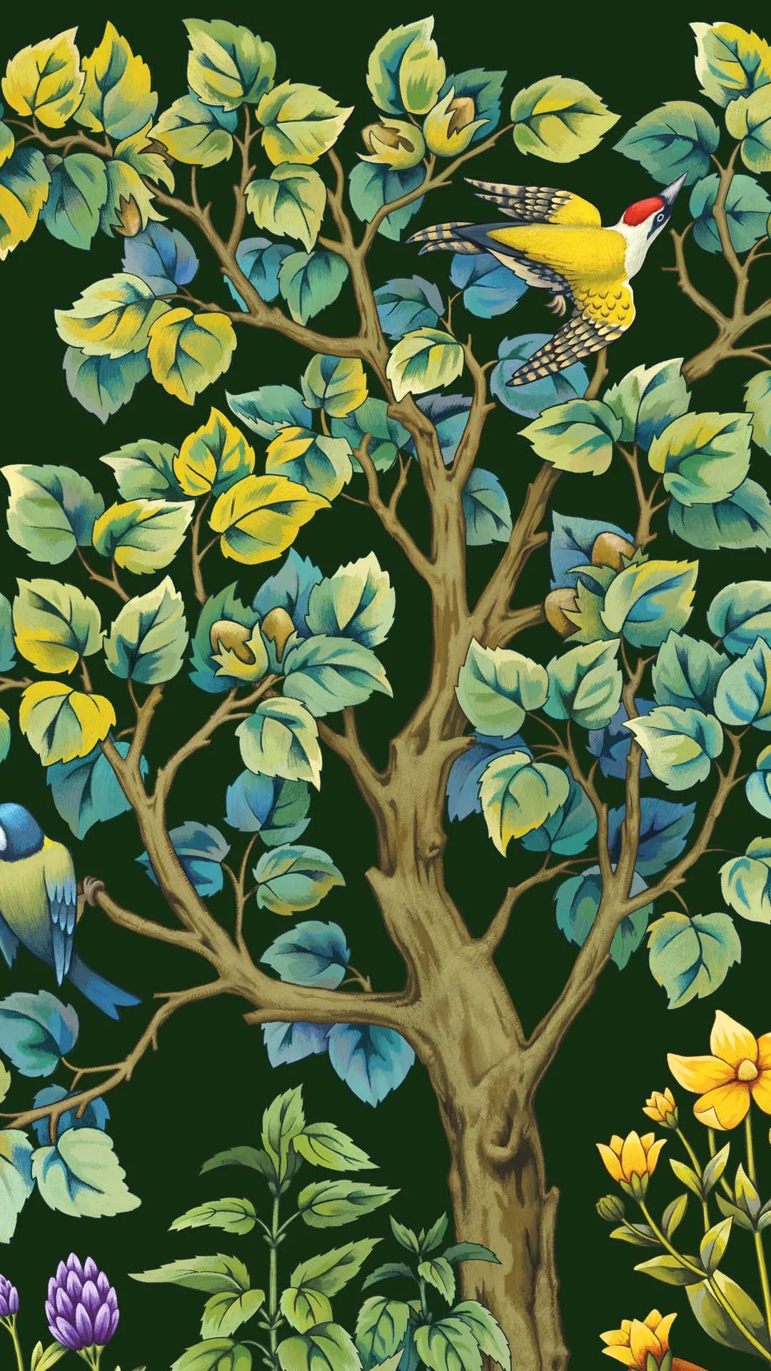
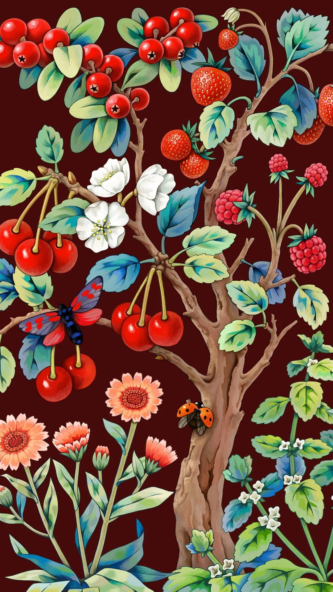
The illustration draws from early twentieth century tapestries — dense forest compositions in which every leaf, petal, bird and creature receives more or less an equal weight across the surface. What drew us to this reference was the evenness of it, the sense that the whole scene holds together as a single continuous world. It carries the natural environment of the Tatra mountains and it is not too loud and not too specific, which lends enough attention to the rest of the bottle.
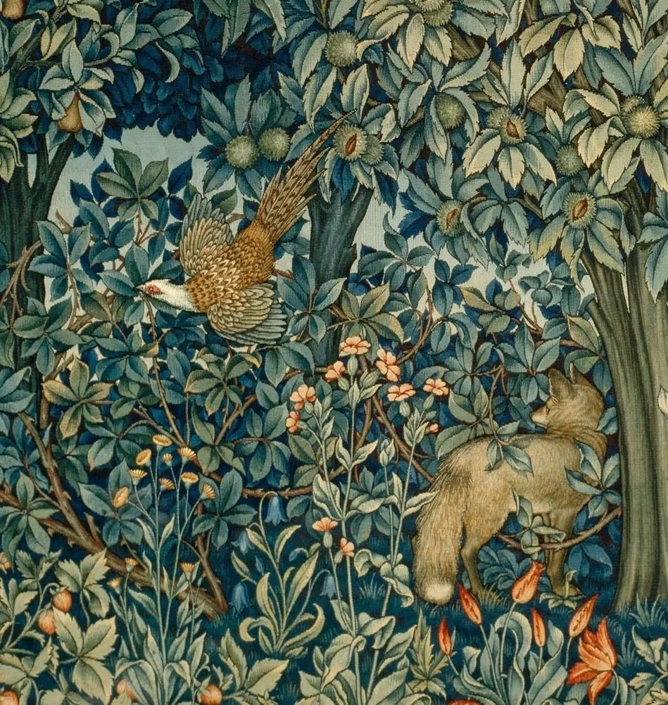
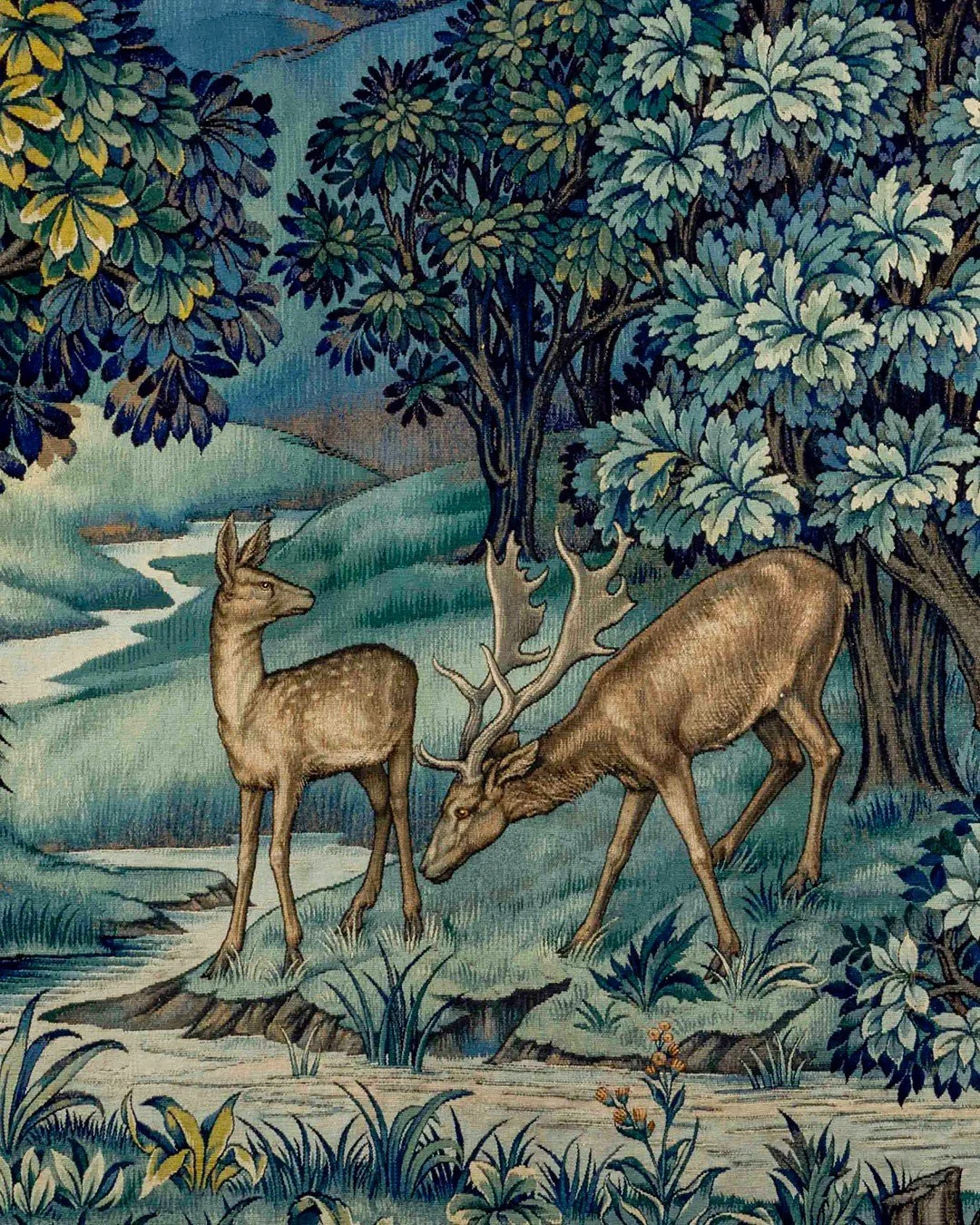
Tapestries desgined by John H. Dearle and manufactured by Morris & Company (1915)
The product names, Velvet and Silk, are a direct reference to the tapestries that inspired the illustration. It is a subtle way to carry that connection through the naming as well.